Visualizing Cell Trajectories from Mastodon in Blender
A tutorial about visualizing biological cell annotation data in Blender.
This post is both a companion tutorial for my talk at VIZBI 2026, as well as an in-depth documentation for the procedural pipeline used in the Mastodon-Blender bridge.
Introduction
Understanding how cells move and divide is an essential task for developmental biologists, which is why a lot of brain juice has gone into finding the best way to track cells in time series of 3D image stacks. These images are recorded by modern microscopes like confocal or light-sheet microscopes and can grow into the terabyte-size realm.
The recently released cell tracking software Mastodon (not to be confused with the social network) can deal with images that large, and supports both manual and semi-automated tracking approaches. The resulting trajectory data are comparatively small and can easily be visualized with the correct procedural pipeline, which is what this tutorial is about.
Mastodon comes with a bridge to Blender that automatically exports trajectories as CSV file, includes any tag sets that were annotated on the cells, and loads the CSV automatically into a prepared blend file. For demo purposes, I preloaded a small dataset of annotated nuclei of a flat worm embryo, simplified the blend file structure and added a few creative touches; the basic principle however is the same as in the blend file officially shipped by the Mastodon package. You can download my demo file here to follow along:
To visualize the trajectory data, we will use the procedural tools available in Blender. After importing our CSV data through a Python script, we will use a Geometry Nodes modifier that generates geometry such that each nucleus is represented as a spheroid, and the trajectories are rendered as tapered tails in a user-defined visibility range. We will then apply a procedural material to the generated geometry, allowing us to color the cells and tracks by the attributes that were imported from Mastodon (e.g., ancestry, and cell division data). Finally, we will light our scene, render the image and perform a few basic post-processing steps with Blender's procedural compositor workflow to make the rendered image look real pretty.
The goal of this project is to create an easily reusable and tweakable visualization pipeline for biologists that want to animate and visualize cell trajectories and cell ancestry data. The representation is artistic and neither attempts to achieve photorealism, accurately depict cell radii or show segmentation data (which Mastodon does not provide).
Data Import
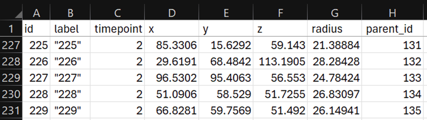
While Blender supports all kinds of data types for importing, we'll be focusing on CSV files here. They are easy to generate from any source, and the workflow can be generalized to many scientific domains. Blender now supports loading CSV files directly through an Import CSV node in Geometry Nodes. This sadly has the disadvantage of only loading columns with numerical content (at the time of writing at least), and in my testing it also tended to skip columns with NaN values on very long tables. So for our bridge we used the scripting approach instead. Below you can see an example CSV file. Each row encodes a cell annotation (also called a spot) with a unique ID, XYZ position, timepoint, a radius (Mastodon only annotates cells with spheroids, not segmentations) and a parent ID that tells us which spot in the previous timepoint this cell corresponds to—we will need this to create trajectories.
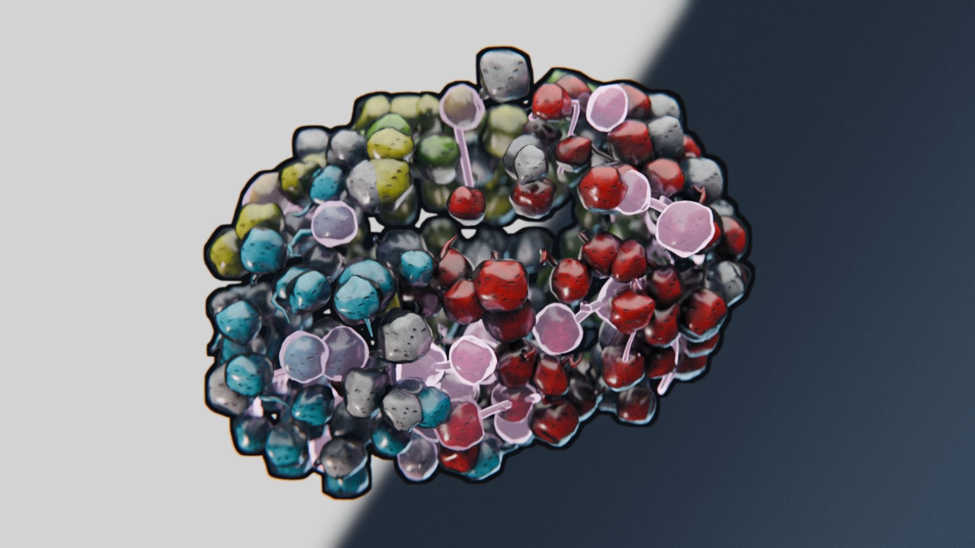
In the Scripting workspace, you will find a Python script that loads a CSV file and turns each row into a vertex, and connects the vertices by tuples of id and parent_id as edges. The script then stores several attributes on the mesh. Attributes store data of a specific data type on a certain domain of the object. Possible domains are: points, edges, faces, spline curves or mesh instances. To give an example, the script stores an attribute called timepoint on each vertex and edge as an integer value, and it extracts certain color tags from the dataset and stores them as color attributes on each vertex. In the case of our demo file, these color attributes encode cell division events and the cell ancestry (this embryo started with four cells, each of which yields a long lineage of cells, and each lineage gets assigned a distinct color).
After running the script, we will see this messy ball of trajectories (no need to run the script in the demo file, the mesh is already imported):
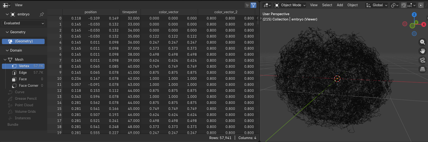
On the left side, you can see all the imported attributes, currently showing the vertex domain, totaling almost 58,000 annotated cell nuclei.
Creating the Nuclei
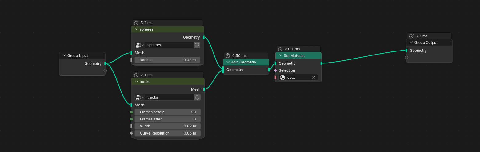
With our data imported as a basic mesh, we can now dive into Geometry Nodes. Head over to the Geometry Nodes workspace and you should already see the final node tree:
Well that's too great, I just spoiled you the whole rest of the tutorial. I'll just pretend that we're starting from scratch here and disable the rest of the node tree for now.
You can see that I deconstructed our visualization problem into two smaller problems: rendering the nuclei, and rendering the tracks; each problem gets their own node group. Node groups are great for organizing large node trees and reusing functions that you will need again elsewhere, not unlike conventional programming. Let's deal with the nuclei first. You can enter a group by clicking on it and pressing Tab .
The first few nodes already perform most of the heavy lifting: our messy base mesh is passed to an Instance on Points node, using a UV Sphere as the instanced mesh. An instance is a perfect copy of a mesh, rendered on the GPU at each position given by the Points input socket. This is very performant, but only allows for basic transformation of the instances (scale, translation, and rotation). Per default, the instancing node would place one of these spheres on each vertex in our base mesh. We only want to see the nuclei at the current timepoint, however. To fix this, we can pass a boolean selection to the instancing node. The selection is simple: we compare the timepoint attribute of each vertex (remember, the importer script added these attributes to all vertices) with the current frame number. Blender has a timeline for animating objects, and every frame has a distinct frame number. So if we only select those vertices whose timepoint attribute equals the current frame, this is what we get:
You can also see that the sphere radius is connected to the Radius input of our group; this is simply to expose the radius value as a parameter that is easily accessible to the user without having to enter the node group. We also store a 2D vector called UVMap on each face corner of the sphere. UV maps are useful attributes that are passed on to the material shader and that will allow us to map textures onto the spheres more easily. The Set Shade Smooth operator then simply interpolates the sphere's surface normals to make them appear smooth without requiring high-resolution meshes. Finally, we store the Index attribute for each instance (I'm calling it cell_id here), which might come in handy for randomising surface features later on.
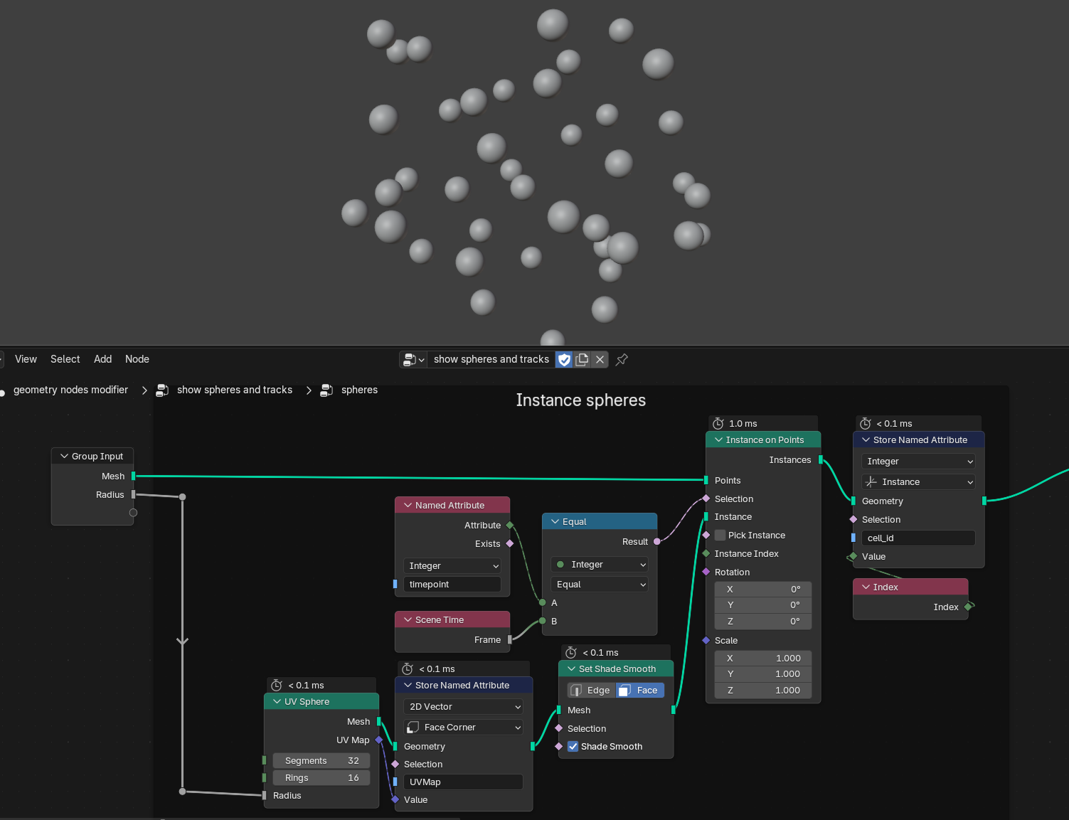
Next up is a purely artistic tweak: we randomize each sphere's scale by a small amount to make each cell look a bit more unique. Blender gives us a range of options to access pseudo-random numbers. We could simply choose the Random Value node to get randomized values for every instance. This approach however is not temporally stable, meaning the cell sizes would jitter with every frame, because Blender doesn't know that spot A in timepoint 1 and spot B in timepoint 2 belong to the same cell. Instead, we can use a Noise Texture that gives us differentiable and spatially consistent random numbers (aka. Perlin noise), meaning our cells may become larger or smaller over time, but they won't fluctuate as much between timepoints.
After we scaled each instance, we perform Realize Instances—this turns every instance (remember, its still a single mesh under the hood) into individual geometries, which we will need for the next step: displacing the surfaces to make the cells w o b b l e.
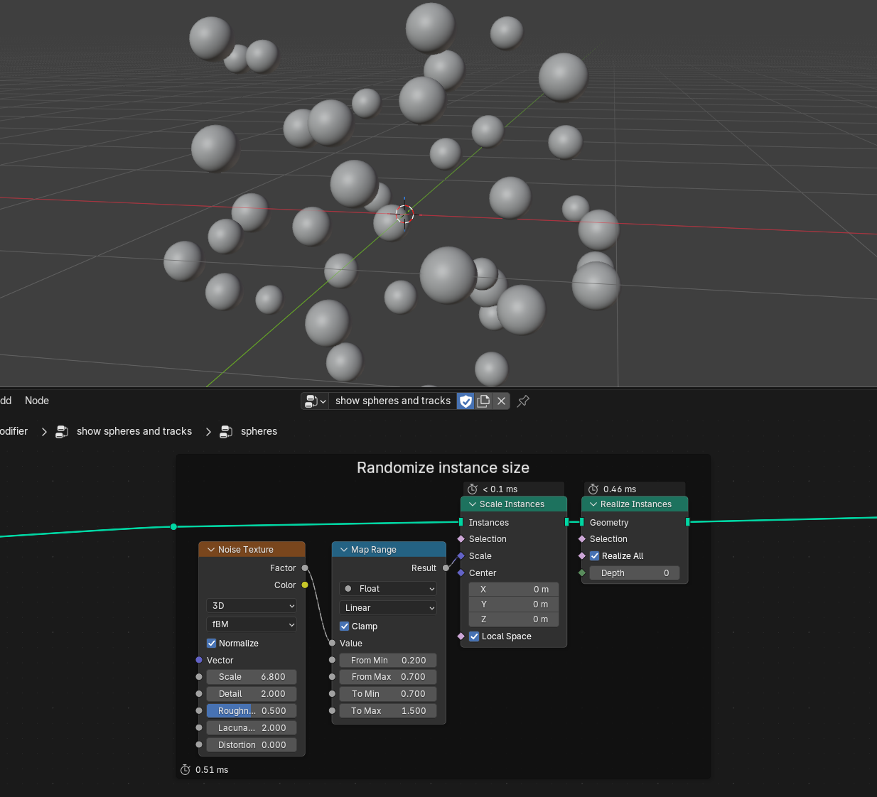
This is the final step in our nucleus visualization; we take another noise texture, map its Color output (which has three components, just like a movement vector) with two math nodes from its default range 0..1 into the range -0.1..0.1 and offset every single vertex with the resulting vector using the Set Position node.
Playback now looks like this:
Creating the Trajectories
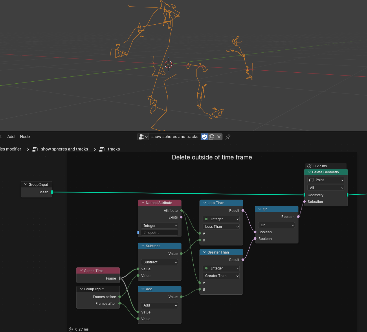
Onwards to the second node group. Here I exposed four parameters to the user: Frames before and Frames after define a visibility window around the current timepoint, in which we want to render the trajectories. Width lets us fine-tune their tubular width, whereas Curve Resolution is mostly a performance parameter that we will use to control the trajectories' tangential resolution.
Similarly to how we constructed our selection for the nuclei instances, we can now compare the timepoint attribute to the current frame, shifted forwards and backwards by our before/after parameters. If the timepoint attribute is either smaller or larger than the shifted timepoints, we can delete the corresponding points:
Next up we convert our mesh-based trajectories into curves. Spline curves have the advantage that they can be resampled and interpolated using different spline types, which is what we do here with our Curve Resolution parameter. Afterwards we smooth the trajectories by blurring the Position attribute and feeding it back into the Set Position node (without touching the endpoints), but this is purely a cosmetic effect that makes the trajectories look less erratic.
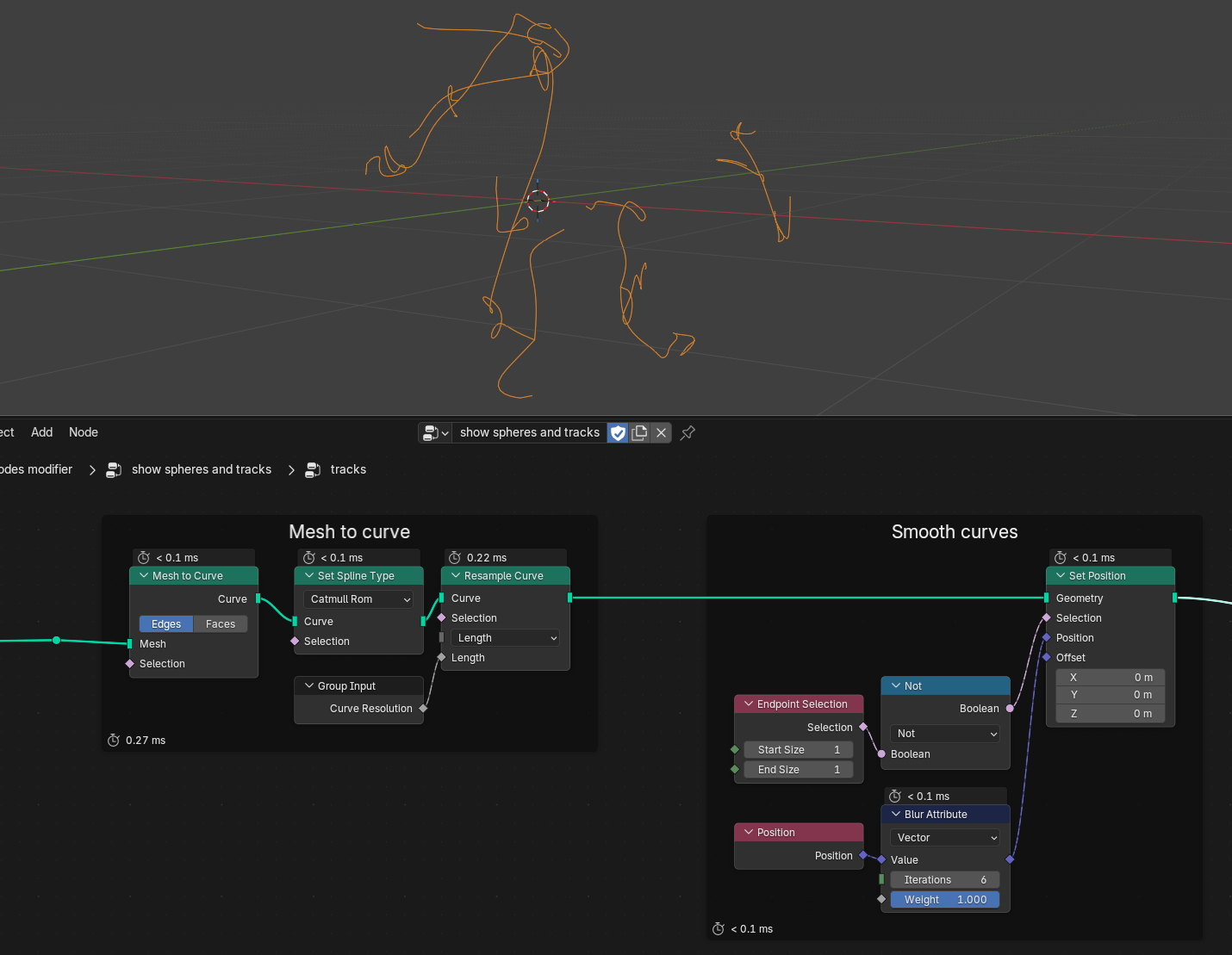
And finally, we make use of another advantage of the curve objects: we can turn them back into meshes by providing a Profile Curve. In this case, we simply want a Curve Circle to define the profile, and its radius is controlled by our previously defined Width parameter:
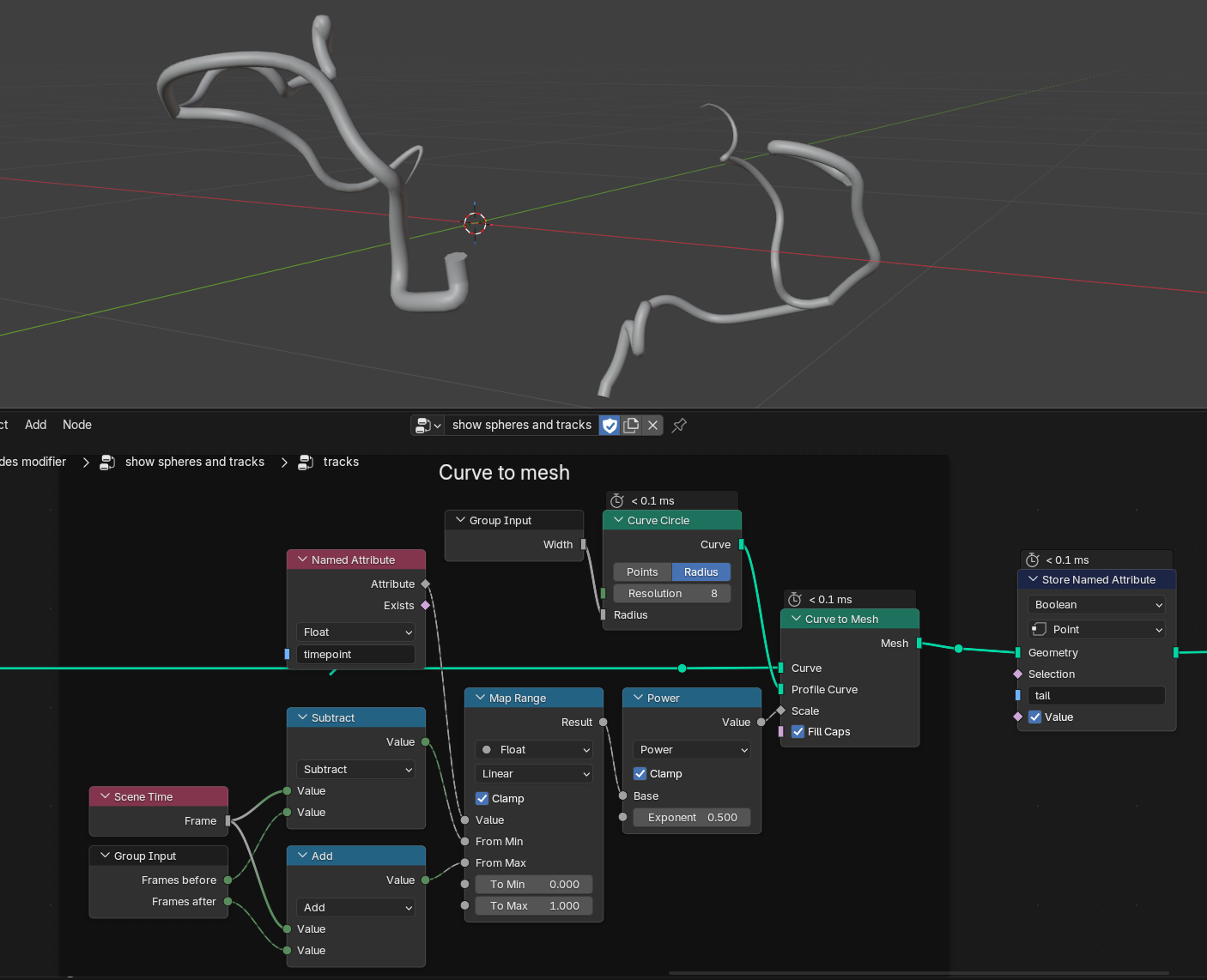
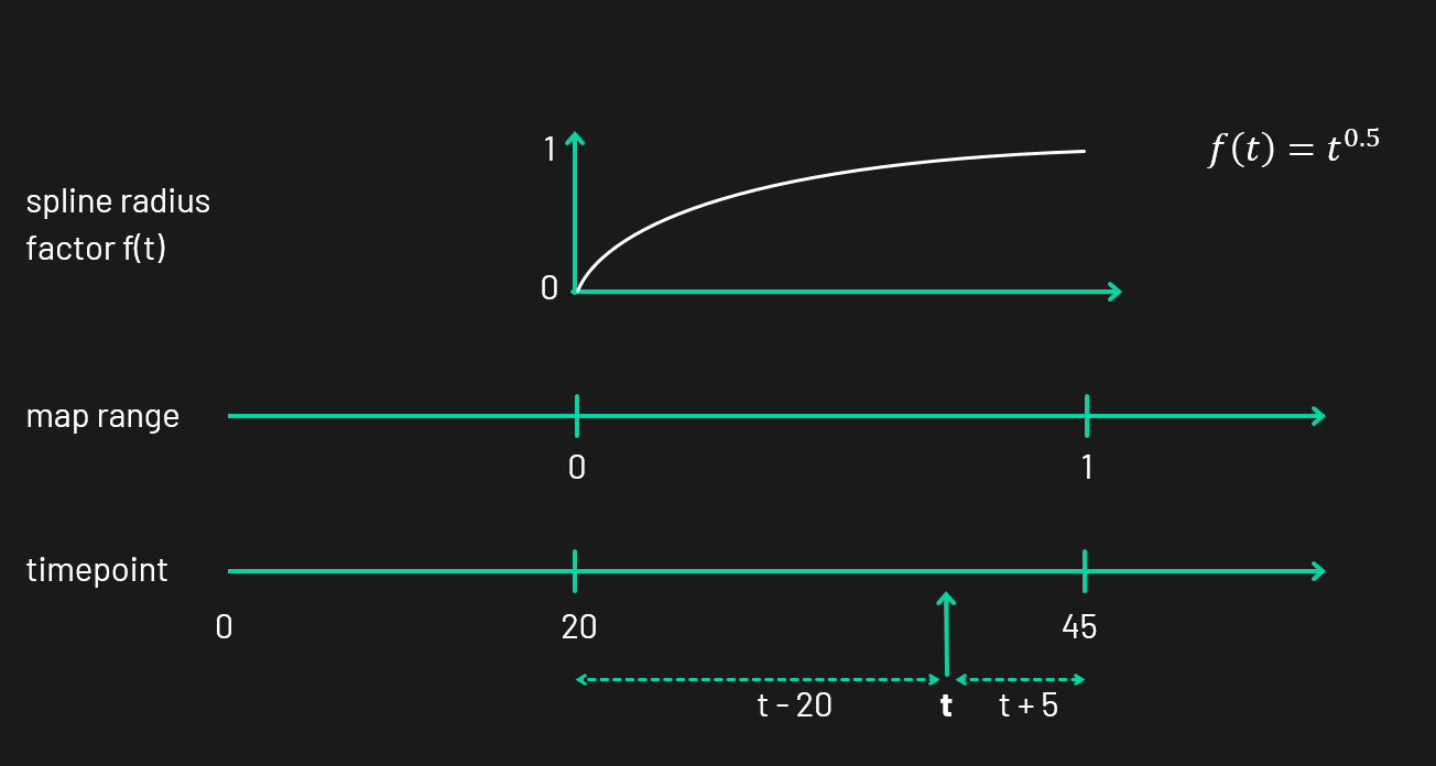
Now, what's with that bunch of nodes that drive the Scale input here? I wanted the tails to taper off, so I had to find a function \(f(t)\) that calculates the thickness factor \(f\) on each point \(t\) along the curve. In principle, this can be achieved by using a Spline Parameter node, which gives you a number between 0 and 1 for every point on the curve. However, we're dealing with branching trajectories here, meaning each sub-branch is a separate curve itself under the hood. That means the thickness would reset itself after each division event. Luckily for us we can use the timepoint attribute yet again to remap the minimum visible timepoint (in the following diagram it's 20) to the maximum timepoint (45). With the help of the Map Range node (seriously the unsung hero of many node graphs) we can easily map this range from 0 to 1, which makes it easy to apply nonlinear functions like \(f(t)=t^{0.5}\). This gives us a nice tapering effect without thinning out the trails too soon. Bonus effect: with the exponent, tweaking the falloff is really easy.
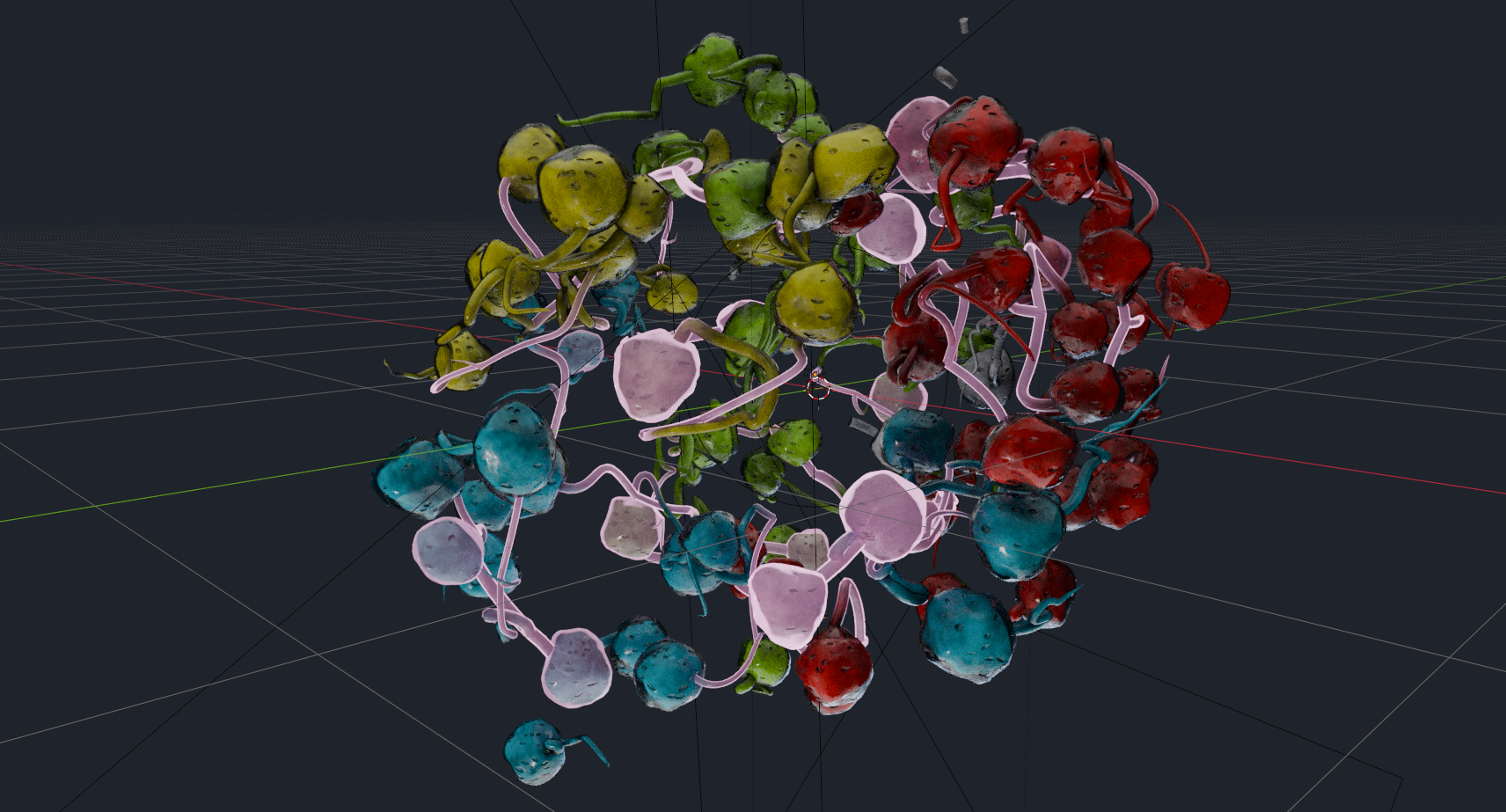
As the final step inside the trajectories node group, I store a Boolean attribute called tail on all the trajectories. This allows us to use it as a selection in the material to separate nuclei from tail geometries; it's only needed if they share the same material though (which they do, in this case). This is what the trajectories look like combined with the nuclei:
Materials
With all of our pretty geometry in place, we can move on to add color to the surfaces. After we joined the tails and the nuclei in Geometry Nodes, I set a material for them via the Set Material node. We can now edit this material by switching to the Shading workspace.
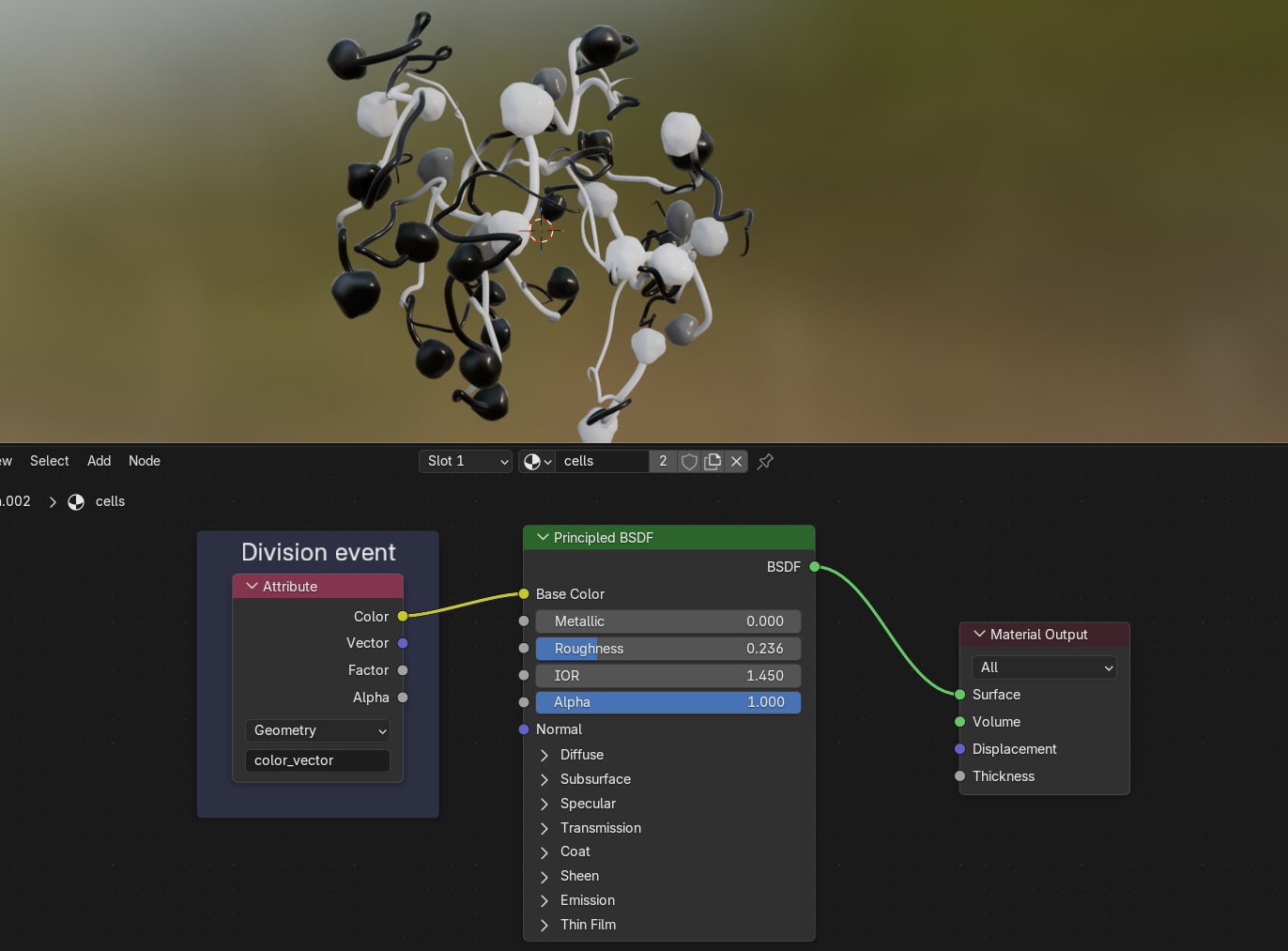
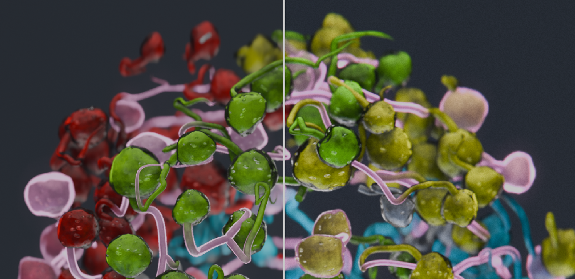
A Principled BSDF shader is always a good starting point for your material. It provides input sockets for all sorts of surface properties, from base color over roughness and metalness to emission or transmission. If we plug the attribute called color_vector into the shader's Base Color, we can see that this attribute encodes proximity to division events. Since both the nuclei and the trajectories were created from the same base mesh, they both inherit the color_vector attribute we imported from Mastodon with our script.
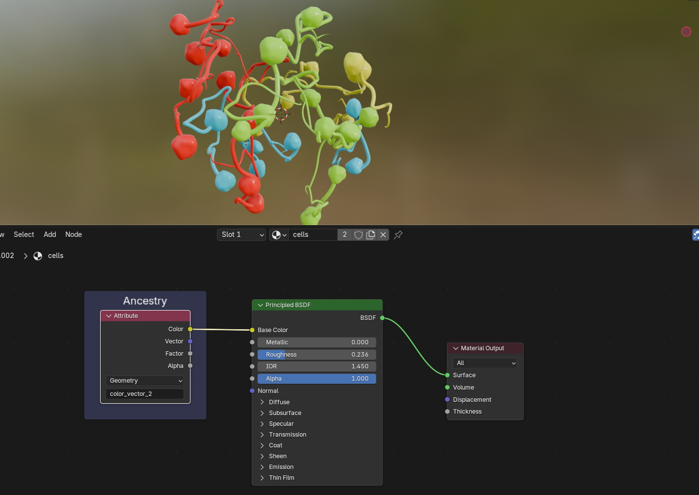
We can also take a look at what color_vector_2 stores: the ancestry of cells, starting with four initial cells of the embryo:
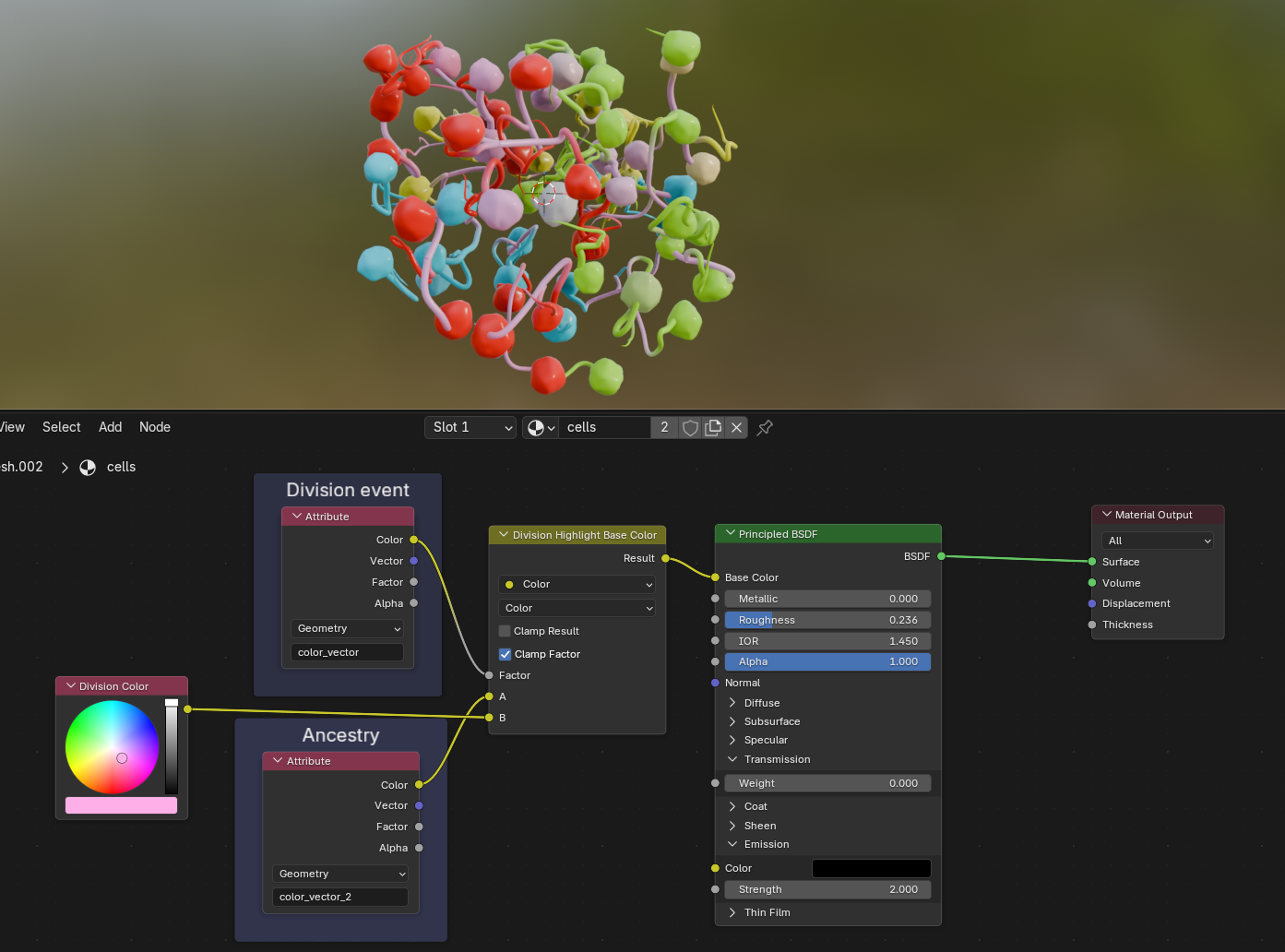
We can then use the division events to mix between the ancestry color—which I wanted to be the base color for all cells—with an arbitrary second color that highlights the cell divisions. The yellow node is simply a renamed Mix node:
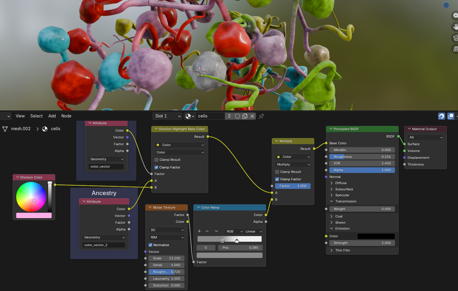
Next, let's mix in a noise texture to make the base color look less uniform. The same Perlin noise texture node that we know from Geometry Nodes is also available in Shader Nodes; I run it through a Color Ramp node to adjust the noise contrast and strength. Using the Mix node in Multiply mode makes all colors darker:
To give the nuclei a bit more depth, we can mix in a bit of Ambient Occlusion; this node darkens surfaces in close proximity to each other and is handy for creating diffuse shadows, cavity dirt and similar effects:
To create even more detail on the surface, we can also randomize the Roughness of our shader with another noise texture:
The following step is yet another artistic touch; it attempts to resemble nucleus pores. Blender provides us with a useful texture type called Voronoi noise, which—if remapped properly—will yield small randomized dots. The random noise we used earlier is spatially consistent, so when a cell moves through space, the noise changes on the surface. Since the cells are pretty erratic, this isn't really noticeable. The pores however have a distinct pattern, and so it would look weird if we let the pores move over the surface in the same manner. This is where understanding texture mapping types comes in handy.
Per default, noise textures will use the Generated coordinate space implicitly, which essentially assigns each vertex a texture position in 3D space. In the case of our pores, we will use UV space instead. The most easily understandable example of this is unwrapping a cube to its six sides and placing them on a flat texture. Each vertex of the cube is then mapped to a U and a V coordinate in 2D texture space that sticks to the geometry. We did the same when we stored the UVMap attribute on our UV spheres before instancing them as nuclei in Geometry Nodes. We can now access these coordinates in the shader and use them for the Voronoi node. I'm also adding the cell_id to the UV coordinates here as a very hacky way to shift the texture on each nucleus to prevent repetitive patterns. The dot texture is then used as Height input for a Bump node that performs a per-pixel adjustment of the surface normals to basically fake geometric detail and create pores on the surface.
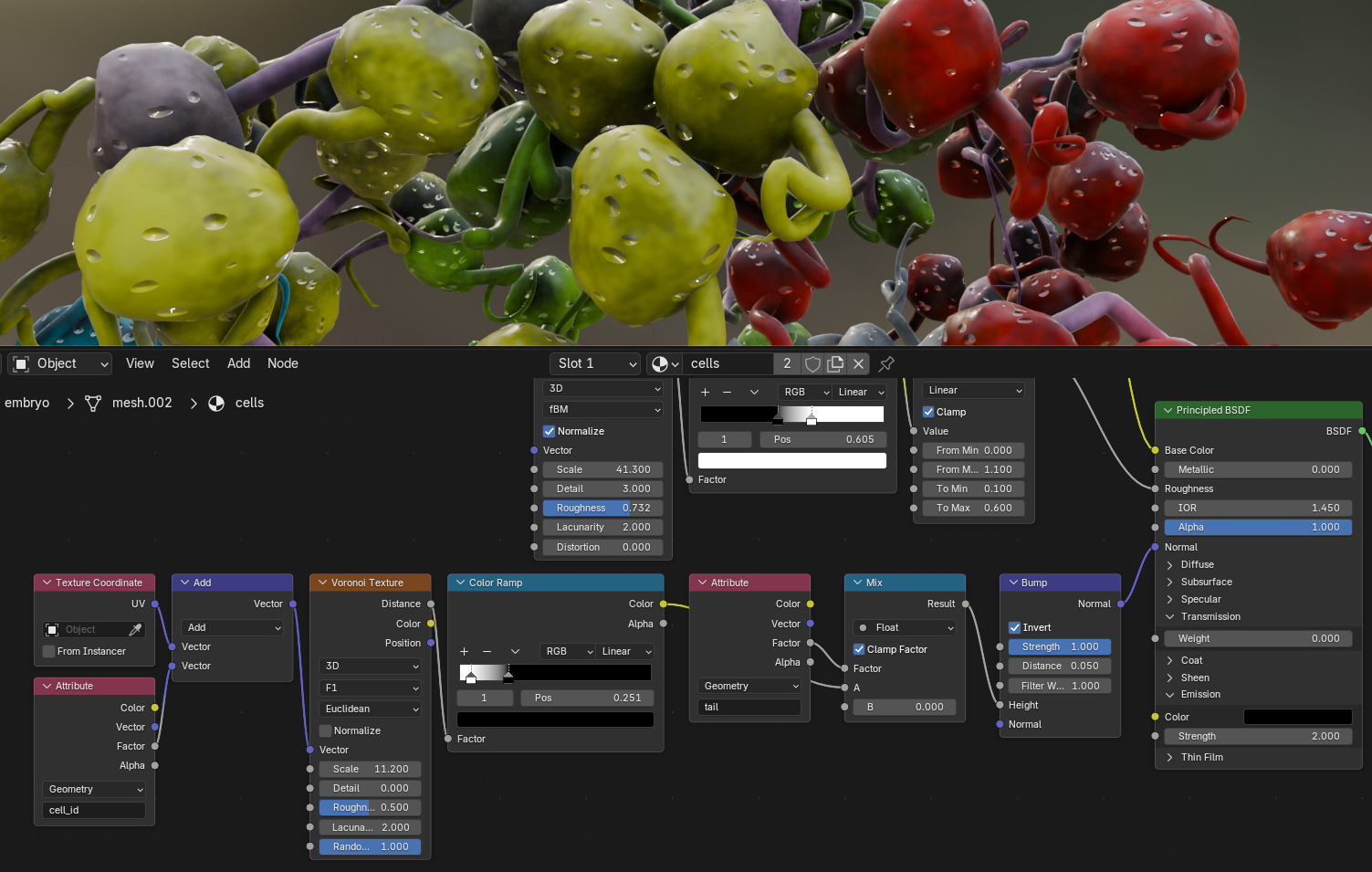
It would be nice to highlight the cell divisions even more, and at the same time add a translucency effect around the borders of the nuclei to hint at the fact that these nuclei are covered in a membrane filled with plasma. For this, we are going to use the Layer Weight node. This node compares the view direction to the normal directions of the surface, and thus highlights the areas that face away from the viewer. We can use it to drive both the emission (reusing the division color we defined above) and the Transmission to get something of a membrane effect:
Lighting
Okay, so we got ourselves a procedural mesh and a procedural material. What's left to create a proper render is… drum roll… lights! Getting good at lighting your scenes requires both intuition, experience, and trial and error. Knowing how light behaves is a good skill to have here (e.g. by dabbling into photography or drawing). There are countless different ways to light your scenes; Gleb Alexandrov has a couple of great tutorials on realistic scene lighting in Blender. It boils down to what story you want to tell and what you want the viewer to focus on.
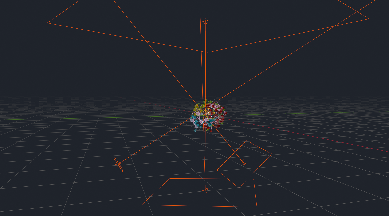
I decided to go with a very large area light from the top that creates a soft, diffuse light. A stronger and smaller area light from below creates contrast and emphasizes the shape of the nuclei, while two fill lights from the sides soften the shadows. A point light in the center then makes it look like the embryo is glowing from the inside. In the viewport, it looks something like this:
Time to animate our camera. I chose a simple follow-path animation that moves the camera around the static embryo, while rotating it so that it always points towards the center. With this done, you can hit Render Image to prepare for the final step:
Compositing
Blender provides a third node-based system, called the Compositor. It allows you to manipulate the rendered image by layering different render passes over each other, applying effects or color grading your footage. The compositor also allows you to export specific render passes (e.g., only the depth buffer, or a segmentation mask) directly to disk. This is handy for when you either want to continue editing your renders in another program, or for some downstream machine learning task.
Post-processing your renders is a great way to give them finishing touches and for creative storytelling. Always use the effects with intent: do you want your render to look like a studio shot? Or like it was taken with a GoPro? Maybe you want to posterize it for a stylized look, and add black contours for a cartoon effect? In the case of the embryo, I wanted the image to look crisp, with subtle hints that the image was taken with a real camera.
When you head over to the Compositing workspace, you will find that I added a few nodes that are applied to every rendered image before being saved.
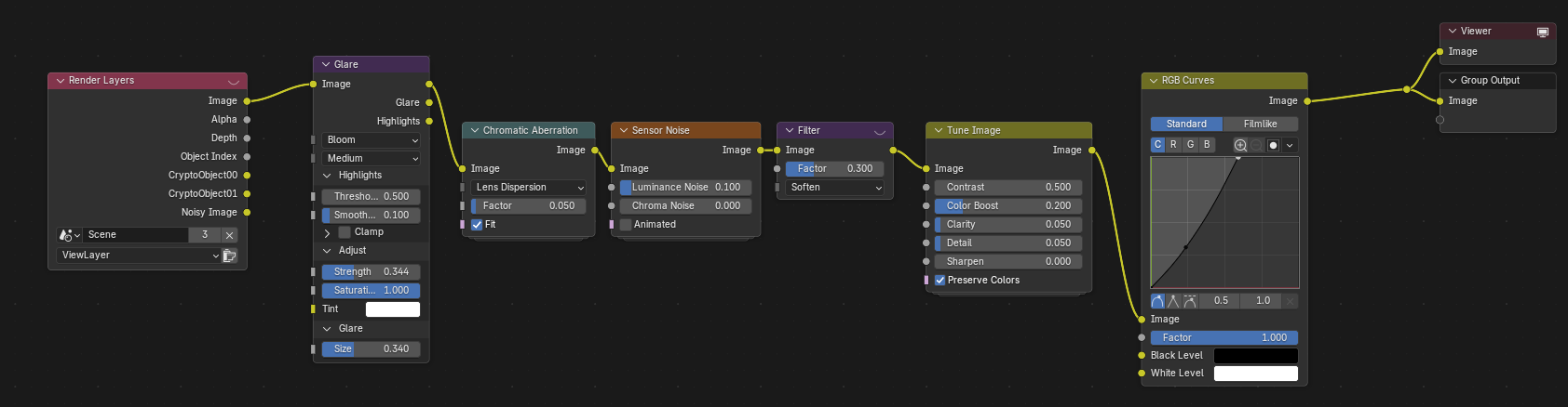
It is generally a good idea to order your compositing nodes in a logical way that roughly follows the path of light:
- Image compositing: if you rendered several render passes or different layers, now is the time to merge them together. In our case, we only have a single render layer.
- Scene effects: Things that happen in the scene. This could be a lens dirt texture, or haze or fog that you create with a depth buffer.
- Lens effects: After traversing the scene, the light hits the lens. Vignetting, distortion, and glare are typical lens effects. I am using a glare effect, followed by chromatic aberration, both very subtle to not distract from the actual image.
- Sensor effects: You can add a subtle sensor noise effect to help dither gradients or create grit. If its too strong, the
Softenfilter will tone it down. - Color grading: make colors pop, add clarity or sharpness, tweak contrast and tonality, add hue shifts, etc. In our case, I simply boosted the colors and details slightly, and with an RGB curve I stretched the tones to make the image brighter, especially in the highlights; this makes it look less dull. How Blender treats colors is a rabbit hole in itself, and I can recommend this blog post by CGCookie about some of the available color spaces to get started.
With the compositing pipeline in place, you can now render the whole animation. Time to take a look at the result:
Conclusion
If you made it till the end, congratulations, you are a nerd! Or maybe you're a scraper bot that feeds the next generation of LLMs. Either way, I hope you learned something! If you're curious to learn more about cell tracking, our Mastodon paper is a good starting point. The techniques I explained here are fairly generalizable, and you should be able to apply this type of workflow to any kind of input data. Importing your raw data is always a first step, followed by a procedural setup with Geometry Nodes and/or Shader Nodes, and potentially some compositing work depending on your goal.
Check out my Resources section for a collection of scientific and artistic tools, both related and unrelated to Blender (ideas for more resources are always welcome) and lists with useful Youtube channels and communities.
I'm always happy to get feedback and ideas for improvement via my socials (mostly Mastodon—the social kind, not the cell tracking one), because I'm sure there were some points that fell a little short, despite this being a 3.5k word monster of a blog post. I'll try my best to patch any holes you may find!